Never Enough Typography Education: My Type@Cooper Experience
One of the main challenges facing a practicing designer is staying creatively inspired and constantly seeking ways to refresh your skills. Every year, I present myself with various options on how to break my “work routine”, in order to reinvent my design approach and to get new sources of creativity. Last year, I explored the “nomad office” experience. Earlier this year, I took a bolder step with an “educational break;” I put my professional work aside and enrolled in a full time postgraduate typeface design course, the type@cooper program in New York, offered by the Cooper Union University in conjunction with TDC, the Type Directors Club.
I joined the program with a very specific agenda in mind. Continuing education is an absolute must for every designer, and I felt that enrolling in such an intensive program would be refreshing personally and professionally after eight years of continuous professional work in my Netherlands based studio, Tarek Atrissi Design.
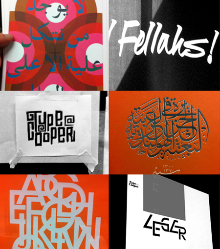
I also wanted to expand my horizon in the world of type design, building on my expertise in Arabic type design and getting more in depth knowledge into the key typeface design principles: technique, technology, aesthetics, expression, history, and theory. My goal was to challenge my established working habits, polish some new technical skills, enrich my typographic culture and explore new possibilities in approaching the type of bilingual typeface design commissions I frequently get.
Most importantly, I wanted to build on my academic foundation in support of my parallel teaching career. I have been giving courses and workshops across the Arab world in lettering and Arabic typography, and felt this course would be an enriching source for new classroom material.
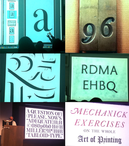
The program, with its 162 in-class hours, exceeded promised expectations. Veteran type designer Sumner Stone, former type director at Adobe Systems, was the lead instructor. He focused on the study of letterform – historical to modern – both by practice (drawing and writing) and theory, by offering an excellent lectures series.
The practical focus of the course was a wonderful reminder of the great and necessary benefits of manual sketching in type design.

Uppercase-focused exercises included drawing the skeleton of the letters VERBSGOHUMAN from the Inguvine tablet V, the bronze tablet dating from the second century BC. This gave us a chance to examine the “essential forms” of letters – in this case from a very specific historic reference. A reminder of the first things the letter-craftsman can do to define the simplest necessary forms that preserve the characteristic structure, distinctiveness, and proportions of each individual letter; before building further on these skeleton forms to render them with a final formal or informal character.
Lowercase-focused studies included writing minuscule letters with the edged pen based on model letterforms written in 1425 by Poggio Bracciolini and experimenting with the order, direction, thickness and angle of the broad edged nib. The most beneficial part of all the manual work was the realization that a hand sketch could be the perfect basis for approaching problematic glyph design while designing a typeface, even when working fully on a digital type-sculpting platform. Taking the habit to draw the letters repetitively before designing it helped tremendously in understanding the structure of the letter and its construction- and in understanding the components that are common to sets of specific letters. These writing exercises were very helpful as well in exploring practical links between Arabic Calligraphy, Arabic Typography, as well as the Latin writing structure. The discussions raised in classes about the challenges of creating a design relationship between the Latin upper case alphabet and its lowercase counterpart echoed to a big extent the challenges existing in any attempt to match the Arabic script to the Latin one within a bilingual design context.

The most exciting part of the type@Cooper experience was with no doubt the access provided to some of the best typographic collections New York City has to offer: The Morgan Library & Museum; The Butler Library at Colombia University; The Grolier Club; and the wonderful collection at the Herb Lubalin typography study center at the Cooper Union. All these collections were incredibly rich with historic type specimens, from both the United States and Europe (plenty of Dutch typographic references that I enjoyed tracing their origins). However, the most valuable find was the wealth of Arabic typographic material available among these collections. Particularly interesting was seeing the original Manuale Tipografico and Bodoni’s original Arabic Type Design, one of 24 different scripts he has worked on in his career.
The access to these historic material raised significant discussions on reviving typefaces, and how one specific source of historical inspiration could be interpreted very differently by different people. In his inspiring lecture on reviving typefaces, Matthew Carter compared type to music: music can’t be reproduced in the exact same way; there are qualities associated with every performance, and each performance of a symphony is a critique of it. Personal interpretation is hence inevitable in any type revival process. The elaborate case study presented by Sumner Stone on the making of ITC Bodoni was an equally enriching in-depth look at the process of reviving Bodoni’s original type.
The technical focus of the course was a chance to advance my font production skills to a new level, with the excellent bulletproof font production trainings provided by some of the key staff at Hoefler & Frere-Jones (Sara Soskolne and Andy Clymer).
This included exploring efficient ways to use the expert’s tricks in Fontlab for creating the most supportive working environment; Looking at the best approaches to properly setting the inter-character spacing of fonts; Great ways to master bezier curves and drawing the smoothest and most agreeable curves for optimized rendering in print and on screen. Most importantly, writing and testing complex Open Type features and looking at typical difficulties in generating and testing fonts, as well as dealing with font naming tables.
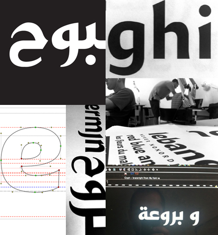
Set within such an excellent typographic environment, the resources and support provided for designing type were exceptional. My time in New York was spent mostly drawing letters, and working on the development of a new bilingual font that I will be soon adding to the list of fonts I have designed over the last decade, and have it available on our Arabic Font Shop. A typeface that I got the chance to have it critiqued by some of the world most recognized type designers, including Matthew Carter, Jonathan Hoefler, Ken Barber, among others. More so, it is a typeface project I have been able to allocate a lot of time to; a refreshing privilege since most of the typefaces I create are custom fonts that are needed for branding projects that usually impose challenging and stressful deadlines.
The untitled font is still “work in progress.” It will probably be finalized towards the end of this year. Included below are some basic sneak previews of the design process and how the typeface’s overall character is taking shape. The main concept behind it was challenging conventional solutions adopted when designing a Latin typeface complementing and echoing an Arabic script in spirit; while maintaining the authenticity of each script without being limited by the over-concern of visually matching the appearances of the Latin and Arabic scripts.
The experience at Type@Cooper was an amazing opportunity to work with leading industry practitioners and meet a talented group of type-obsessed design professionals from all around the globe. This was definitely an adventure I was very proud to fit in my incredibly busy working life, allowing me to take part of a pioneering new level of type design education in the US.
Beyond all that, it allowed me the chance once again to promote Arabic Design and Typography by giving a lecture about Arabic Type design at the Cooper Union, for a wide audience interested in non-Latin type, where I showcased the general challenges accompanying Arabic typography design and practices today, with an analysis of the social and cultural dynamics of the modern Arab world and its resulting influence on the Arabic digital letterform design.


